
CLEAN REPUBLIC
Pioneering a cleaner future.
OVERVIEW
Clean Republic creates eco-innovative cleaning products using a special formulation of three simple ingredients: salt, water, and electricity. They needed help to better communicate this differentiation in the market as well as educate consumers. By amping up their bold look and leaning heavier into their scientific side, we were able to convey both the simplicity of their formulation and the effectiveness of their product.
Created @ The Stable | clean-republic.com
ROLES
Brand Identity
Packaging
UI/UX
Collateral
Social
TEAM
CD: Rebecca Sloat
ACD: Joel Schierloh
LEAD DSN: Tyler DeHague
DSN: Sarah Johnson
STRAT: Nick McVey, Jenna Frank
PHOTO AD: Bethany Schrock, Elle Pollock, Kaya Morris
-
Various concepts were presented before ultimately landing on one direction.
-
Various concepts were presented before ultimately landing on one direction.

LOGO
The logo features a cresting wave in the shape of a “C.” This represents the ocean, which combines the primary ingredients of Clean Republic: salt, water, and electricity.


PACKAGING
The packaging uses a clean white background to help highlight the power and eco-innovation of Clean Republic through the use of badging and simple ingredients callouts.
The team has aspirations for packaging to move into a more sustainable, aerosol-based canister. However, due to supply chain limitations, this progressive transition has been delayed.

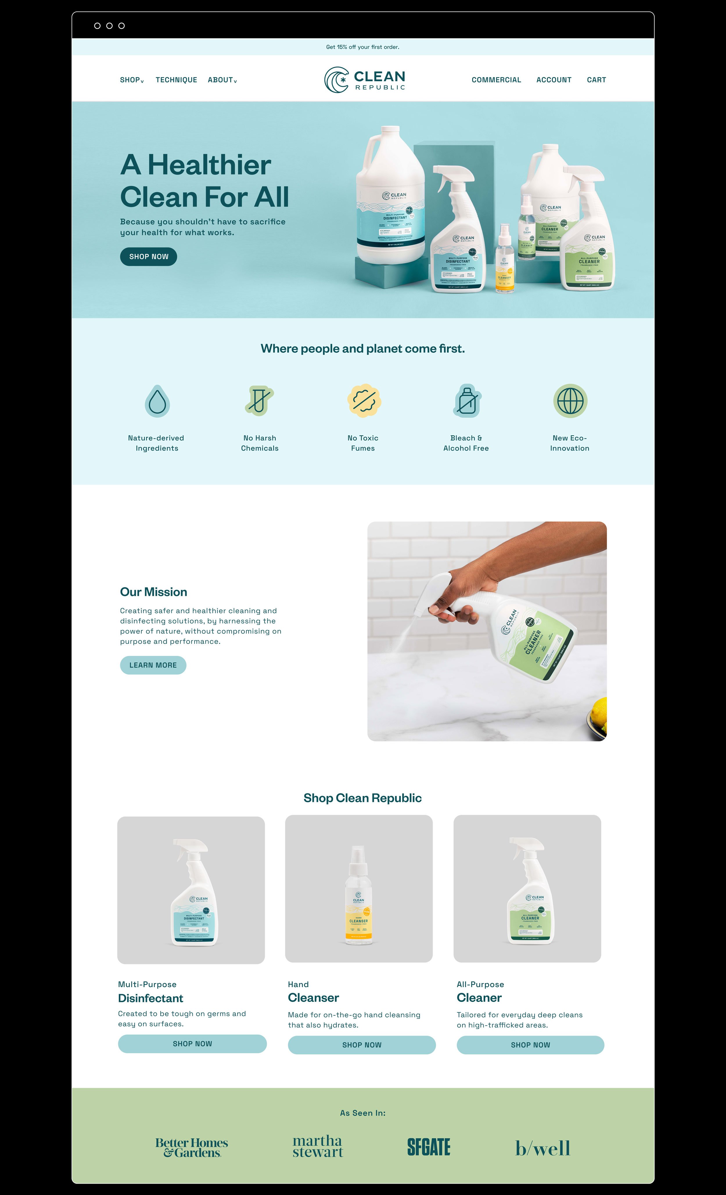
WEBSITE
The website educates consumers on the eco-innovation of Clean Republic, encouraging them to rethink their cleaning product purchases.


SOCIAL
