FARMTRUE
Nourished
by nature.
OVERVIEW
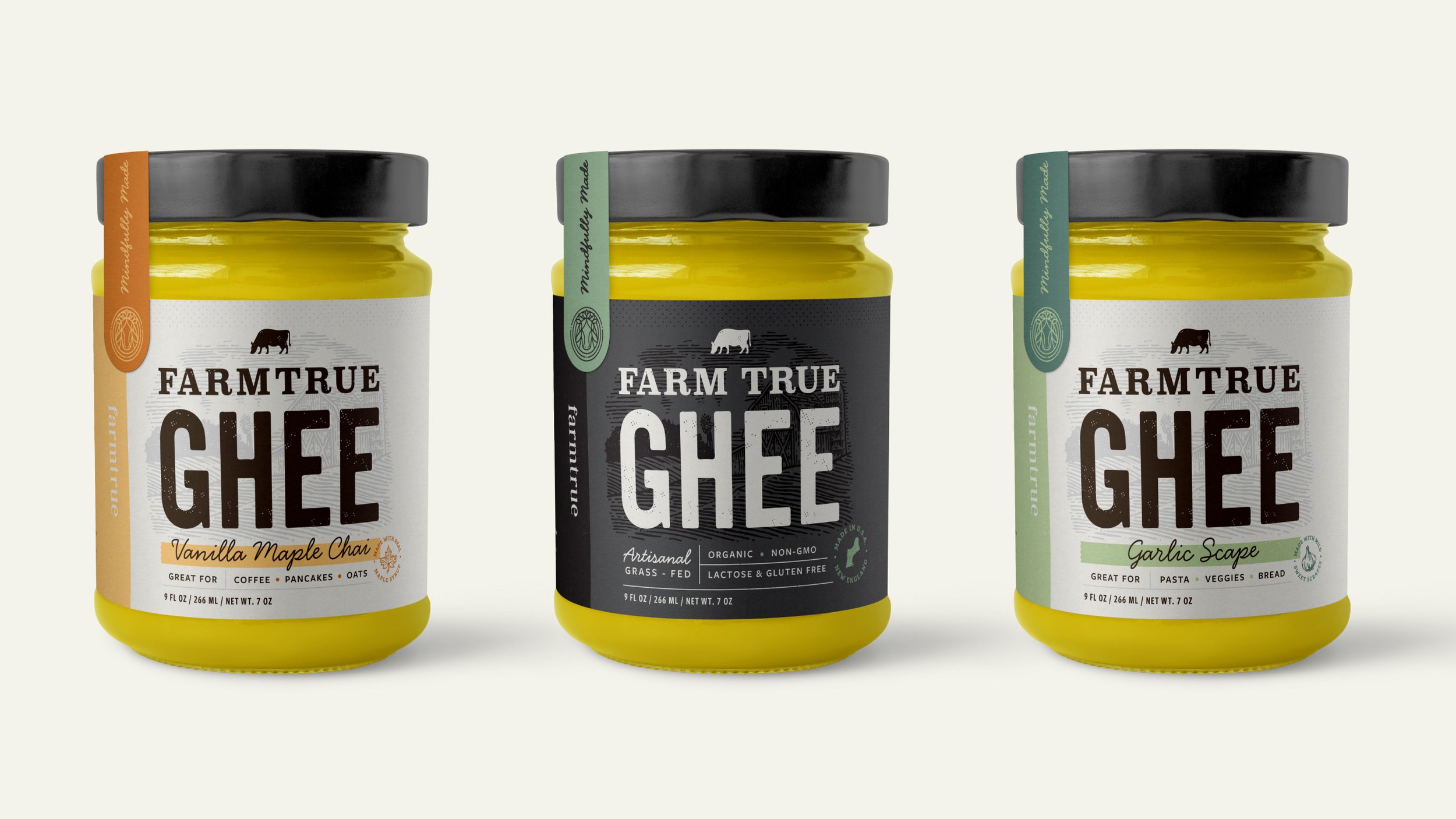
Farmtrue (previously Farm To Gold) focuses on seasonal living and connection to nature through food. Starting small, selling ghee products at local farmer’s markets they quickly gained popularity and were looking to expand their line as well as offerings beyond ghee. With retail in mind, their old brand needed a refresh and new name that elevated them while maintaining their farmer roots.
Created @ Westwerk | farmtrue.com
ROLES
Brand Identity
Packaging
UI/UX
Collateral
Illustration
TEAM
CD: Dan West
LEAD DSN: Tyler DeHague
DSN: Becca Tripp
ILLO: Tyler DeHague

LOGO
The three rings represent the three Ayurvedic seasons of living. While the cow is an obvious staple of their products, the crown of leaves represents their connection to nature.


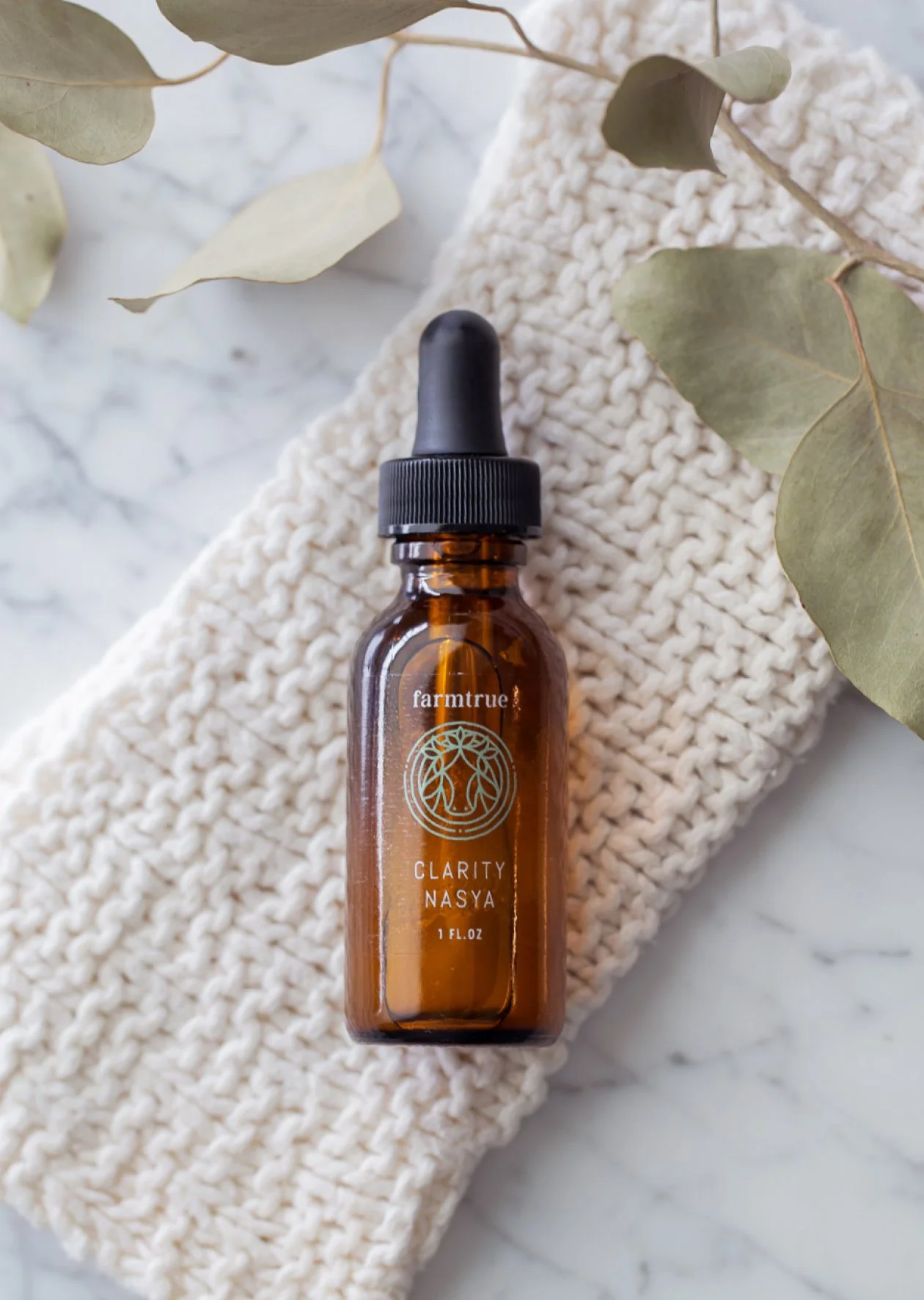
BEAUTY PACKAGING
Expanding into the self-care space, their packaging needed to distinguish itself from the food line to better fit within the beauty category, without losing the farm feel.

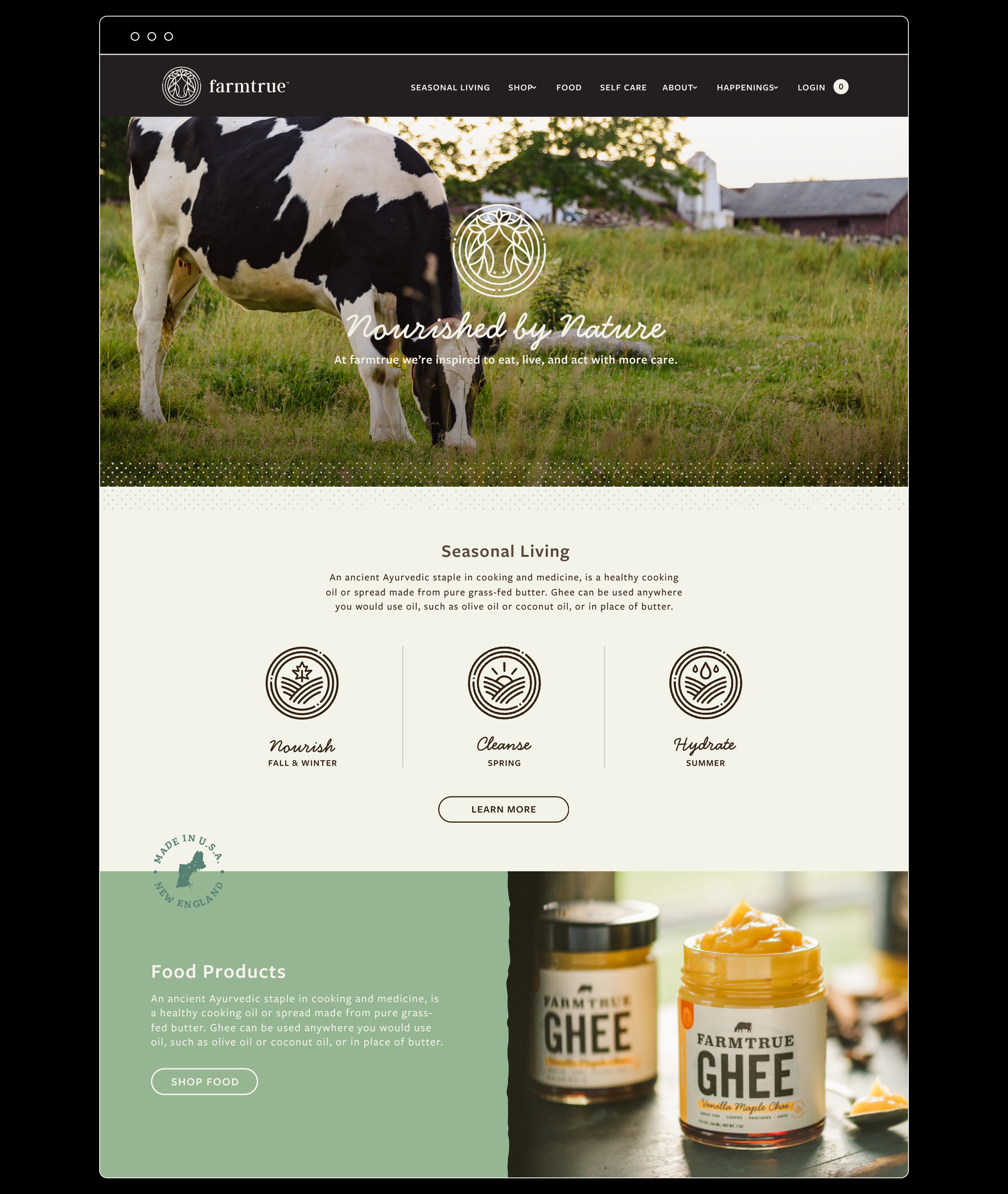
WEBSITE
The website serves as a platform to educate consumers on Ayurvedic living. Providing seasonal products, events, recipes, and more which inspire us to eat, live, and act with more care.